 |
| Image source: Youtube |
It may introduce new stuff, I guessed that, I know Google never stop changing or improving more and more.
I am also a Youtuber who I like watching on it and uploading some stuff related IT, personal hobbies, events, tips etc. These why I have to note its improvement on my channel by updating it to use the new one.
 |
| Old Youtube layout |
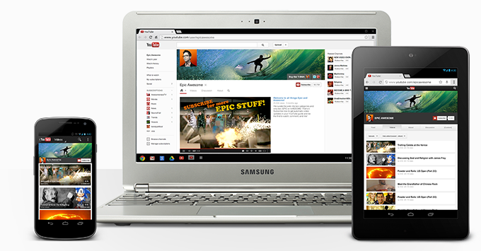
"You are more than the sum of your uploads. On your new channel, branding works across devices, you can reach out to non-subscribed viewers, and you can show off more of your content so fans will go deeper" - YouTube.What impress me to switch to this new changes?
 |
| My sample banner photo |
 |
| Nice Channel Art upload |
- View as public: allow me to check/view it when update or customize any points as public
- Social Links: locates at the bottom-right corner of banner which allows to visible one customized link (to my personal blog), and 4 social links (max links up to 18 social medias: Google+, Facebook, Twitter ...; but visible only 4 links)
- Channel Art (Edit): it allows me to change the cover nicely with adjustable photo to preview both on desktop and smart devices screen
- Customized content/layout: It's really nice stuffs which allow me to customize my videos in a bigger player mode as Trailer, below the banner photo. I can customize all contents (Popular uploads, Recent uploads, All playlist, Likes, Recent post, Recent activities, Single playlist, and Tag) onto first/home page by two layout styles (Horizontal row or Vertical list).
Now I have updated it to the Once Channel as shown in the below photo.
 |
| My YouTube One Channel |
Finally, the old layout that allows to upload photo as background today it is out of my channel. I am pleased to share and keep its new feature tips in my blog. Do you like the new change? Check it out more features!
